Data visualization has a long and enriching history that began in the mid-17th century in Europe.
Back in 1644, Flemish astronomer Michael Florent Van Langren, for the first time, used a one-dimensional line graph, depicting variations in longitude estimates between Toledo and Rome. That diagram was the first recorded instance of data visualization.
However, we have come a long way since then. The immense need to simplify complex data sets in today’s businesses has brought data visualization just a click away. This is important, as today’s world is filled with data that can lose value if not visualized into useful insights.
In 2021, organizations in the U.S. and the U.K. reported managing up to 5PB of data. That’s 5 million gigabytes—a number almost unfathomable to the human mind!
With data volumes growing by 63% monthly, per data professionals, the challenge is clear. Businesses have to follow data visualization best practices in order to fully utilize their datasets.
Adhering to the right data visualization best practices can transform raw data into insightful and actionable information.
As we look forward to the incredible innovations of the past decade, the trends in data visualization continue to evolve.
Interactive dashboards, real-time data visualization, and AI-driven analytics are just the tip of the iceberg. Staying abreast of these data visualization trends ensures that your visualizations are not only relevant but also impactful.
In this article, we explore the top data visualization best practices for transforming data into meaningful business insights.
Table of Content
- How Data Visualization Helps Businesses
- 7 Best Practices For Effective Data Visualization
- Here’s How Kanerika Implemented Data Visualization For Global Businesses
- Kanerika: Your Partner in Data Visualization
- FAQs
How Data Visualization Helps Businesses
Research Scientist Andrew McAfee and Professor Erik Brynjolfsson of MIT noted that “More data cross the internet every second than were stored in the entire internet just 20 years ago.”
This influx, coupled with IBM’s observation that 2.5 quintillion bytes of data are created daily, poses a critical question: What can businesses do with such large sets of data?
Forbes sheds light on this by stating that it is important for businesses to always measure and conform to the quality of their data.
High-quality data stands at the core of informed decision-making, significantly impacting the success and growth of a business. In contrast, low-quality data can lead to incorrect conclusions and business decisions. The mere existence of vast quantities of data isn’t enough. Big data becomes a powerful tool only when it’s properly understood and utilized.
This is where data visualization steps in.
By transforming complex data sets into visual formats like graphs and charts, data visualization makes content not only more accessible but also actionable.
7 Best Practices For Effective Data Visualization
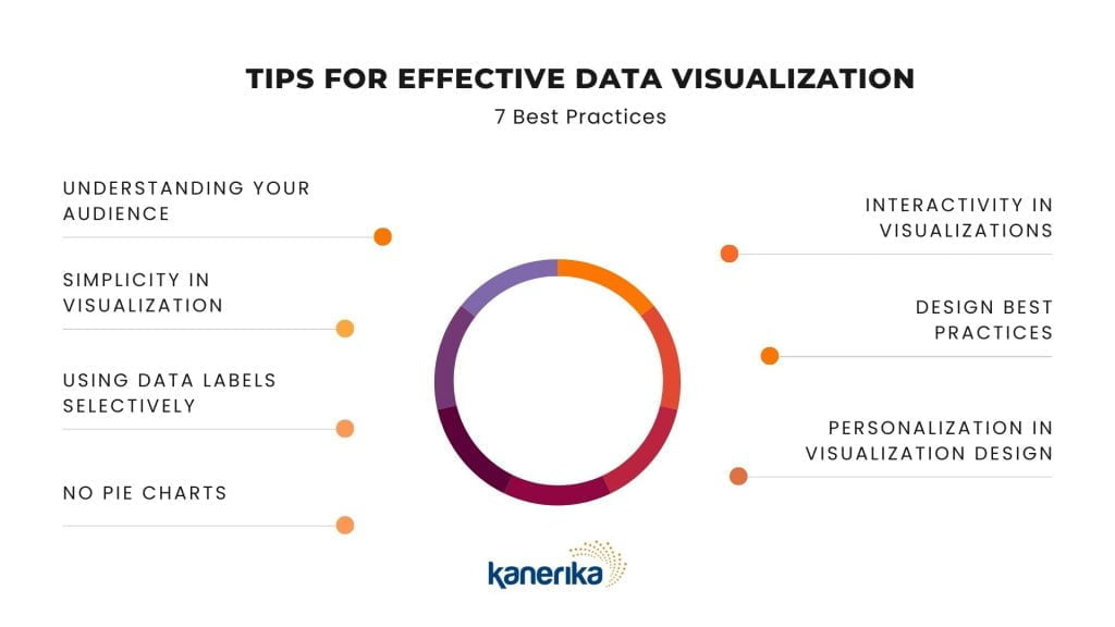
1. Understanding Your Audience: The First Rule of Data Visualization
One of the best practices in data visualization is to focus on designing each visualization to meet the unique requirements of its intended target audience.
Example: Using a bar graph to show increase or decrease in quarterly sales in a business
The key to effective data visualization lies not in creating a one-size-fits-all solution but in tailoring each visualization to meet the unique needs and challenges of its intended audience.
When designing a dashboard or any data visualization tool, the primary question should be: “For whom are we designing this?”
This involves identifying whether your primary audience is executives, a sales team, or a broader demographic. Each has distinct requirements and interpretations of the data. The challenge is to create a visualization that addresses these specific needs while delivering a clear, actionable message.
This approach is often overlooked, leading to a generic visualization that fails to resonate with any specific group. Whether it’s about evaluating risks, profitability, or making strategic choices, your design should guide these decisions effectively.
2. Simplicity in Visualization: Less is More
Complex visualizations often lead to confusion and information overload, which is counterproductive to the principles of effective data visualization. This complexity can also hinder efficiency, potentially leading to missed opportunities.
The art lies in carefully selecting relevant data points, avoiding distracting elements, and creating visualizations that facilitate strategic decision-making and clear understanding.
Embracing simplicity is a fundamental aspect of data visualization best practices. This approach aligns with the concept of creating ‘snackable’ content, crucial in content marketing and equally vital in data visualization.
The aim is to develop designs that provide a high-level overview, enabling users to quickly comprehend the key information and explore further details as needed.
Harvard Business Review highlights this through an example: An HR VP presenting to an executive committee needs to illustrate a slowdown in healthcare cost growth clearly and concisely. Should he display an entire report filled with differently-colored graphs to highlight this, or does he create a limited number of graphs that capture the slowdown in growth?
He should ideally follow the second option, as it has concise information presented in simple yet effective visual format.
3. Using Data Labels Selectively
Effective data visualization hinges on the judicious use of data labels.
These labels are crucial for imparting direct information about specific data points, like exact sales figures in a bar chart.
However, their overuse can clutter and confuse the visual narrative. The solution lies in strategic placement—either inside or outside chart elements.
In crowded visuals or when dealing with numerous data points, positioning labels inside bars or pie chart slices can prevent overcrowding. This selective approach enhances the viewer’s understanding while maintaining a clean, organized appearance, aligning with data visualization best practices for conveying actionable insights.
4. The Case Against Pie Charts
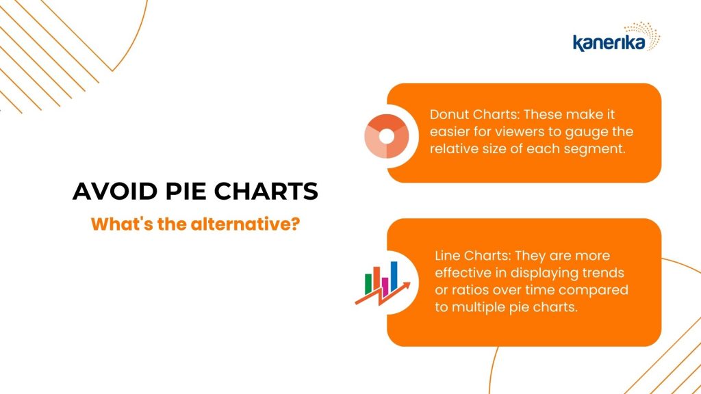
Here’s a hot tip from leading data visualizers: avoid pie charts.
Pie charts often falter in effectively conveying complex data due to their reliance on viewers comparing angles or areas, hence, the potential for misinterpretation.
What’s the alternative?
- Donut Charts: These address the issue of comparing angles by focusing on the length of the arc, making it easier for viewers to gauge the relative size of each segment.
- Line Charts: They are more effective in displaying trends or ratios over time compared to multiple pie charts. Line charts provide a clear, continuous progression of data, making it easier to identify trends and patterns.
5. Interactivity in Visualizations: Engaging the User
Modern data visualization best practices emphasize going beyond static images to create more interactive user experiences.
Integrating features like tooltips, filters, and drilling transforms visuals into interactive platforms. Here’s how they work:
- Tooltips provide contextual information on hover, enhancing understanding
- Filters allow users to examine specific data segments, isolating trends or subsets.
Data visualization and AI can go hand in hand to create such interactive experiences for users.
Businesses can consider using AI-powered data tools that enable natural language interactions, like chatbots, for querying and forecasting.
6. Adhering to Design Best Practices in Data Visualization
If there’s one thing all data visualizers can agree on, it’s this – good data visualization ensures accessibility for all users. Including those with visual impairments.
Ask yourself the following questions to determine the efficiency of your data visualization:
- Does the use of color and labels clearly highlight key patterns and provide readable, informative context?
- Are the elements proportionally accurate, ensuring no misleading representations?
Here are some high-level design practices that can lead to effective data visualizations:
- Adopt high-contrast color schemes, such as dark text on a light background, to enhance readability for everyone. Avoid red-green combinations to accommodate color vision deficiencies.
- Use patterns and textures for differentiation. This will help your data visualizations stand out from one another.
- Utilizing intuitive visual cues like consistent color schemes across charts simplifies data comparison without repetitive legends. Effective labeling adds clarity and context, guiding the viewer’s understanding.
These data visualization best practices ensure data is communicated effectively through visual cues and the appropriate use of colors and textures.

7. Personalization in Visualization Design
In data visualization, a common problem is the disconnect between the data presented and the audience’s engagement with it.
The solution lies in customizing visuals to cater to the specific preferences and needs of your audience.
By choosing creative and audience-tailored approaches to data representation, you create visuals that not only resonate with viewers’ interests but also simplify the understanding of complex datasets.
This personalized approach ensures that users are more engaged and better able to interpret and act upon the data. This enhances the overall effectiveness of your data visualization.
Choosing the Right Data Visualization Tool For Your Business
In the field of data visualization, using the right tool can often save you time and money. This is because of how data visualization tools and software typically work.
One of the most important data visualization best practices is to carefully understand the scope of your data visualization and select a tool that captures most of those requirements.
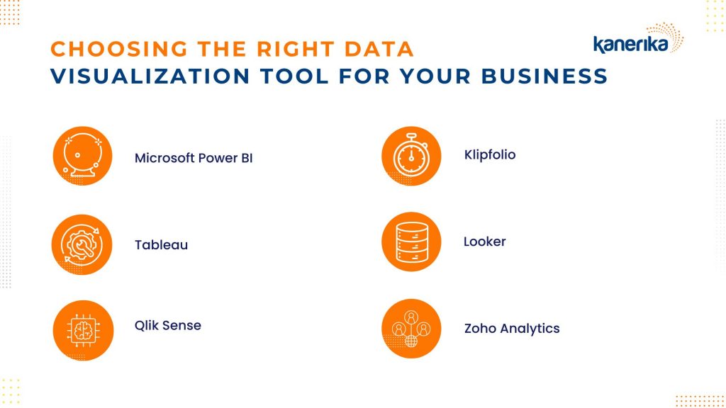
Here are some of the best data visualization tools in 2024 for data visualization:
- Microsoft Power BI: Best for business intelligence with real-time analytics and trend analysis. Ideal for users already within the Microsoft ecosystem.
- Tableau: Known for its interactive charts and AI-driven insights. It has a bit of a learning curve but is excellent for deep data exploration.
- Qlik Sense: Outstanding for its use of artificial intelligence, offering extensive interactivity and fast calculations. It’s a top pick for AI-enhanced data operations.
- Klipfolio: The go-to tool for custom dashboards, allowing seamless integration of data from various sources without coding.
- Looker: Offers a wide range of visualization options through its plugin marketplace, making it suitable for businesses seeking diverse data visualization methods.
- Zoho Analytics: Best for businesses using Zoho applications, providing easy-to-create reports and dashboards with a user-friendly interface.
Here’s How Kanerika Implemented Data Visualization For Global Businesses
Case 1: Data-driven Decisions with Data Transformation and Enhanced UX
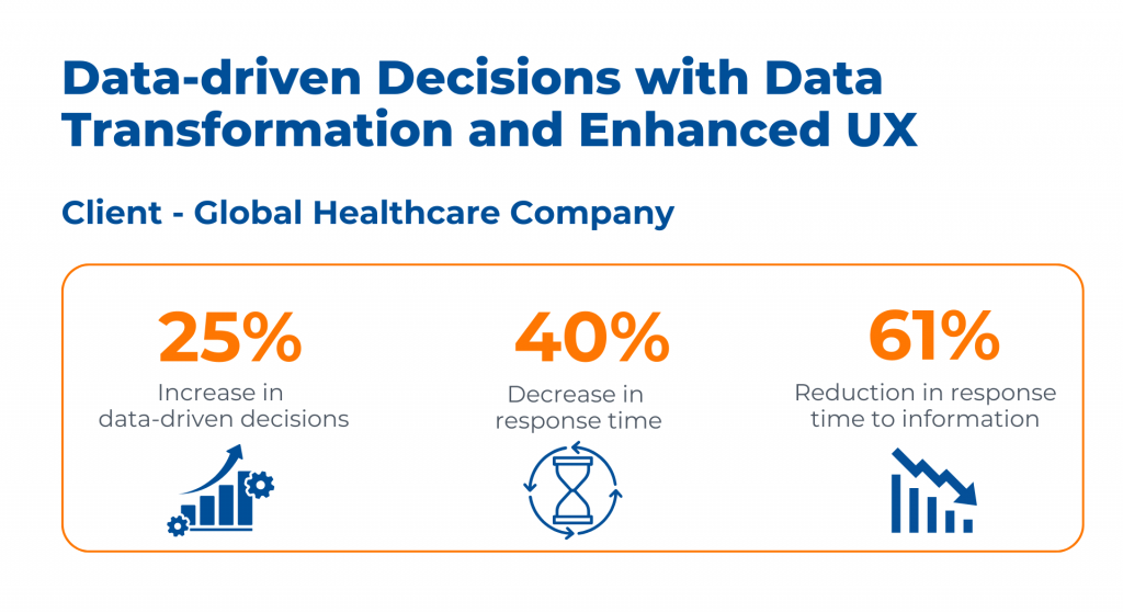
For a global healthcare company, Kanerika tackled the challenges of disparate data and inefficient UI/UX.
By leveraging Snowflake for unified data mapping and implementing Power BI, they transformed the data analysis landscape by enhancing data-driven decision-making through enhanced data visualization designs.
This resulted in a 25% increase in data-driven decisions, a 40% decrease in response time, and a 61% reduction in response time to information.
Case 2: CRM Dashboard Solution Powered by Generative AI
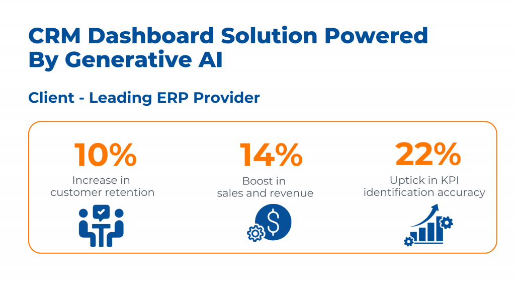
Kanerika revolutionized a Leading ERP Provider’s approach to sales data management. Utilizing Generative AI for a comprehensive and user-friendly CRM dashboard, they enabled better KPI identification, market trend analysis, and improvement areas.
The outcome was impressive: a 10% increase in customer retention, a 14% boost in sales and revenue, and a 22% uptick in KPI identification accuracy.
Kanerika: Your Partner in Data Visualization
Data visualization has evolved to become a business necessity in 2024. However, businesses often need the right implementation partners to develop and execute well-thought out data visualization channels.
This is where Kanerika’s experience makes it a trusted and successful data visualization partner for numerous industries such as BFSI, healthcare, logistics, telecom, manufacturing, and retail.
With a proven track record and expertise in managing the leading data visualization tools, Kanerika’s team of data experts can elevate your business insights and ensure your business makes the most out of its data.
Connect today for a free consultation!
FAQs
[faq-schema id=”27022″]


15 Responses