Data alone is not enough. What use is a database if the top decision-maker of a company cannot understand it easily? That is where data visualization becomes critical. It is a powerful tool for analyzing and communicating complex data sets. In business, data visualization is used to analyze market trends, track performance metrics, and identify areas for improvement.
What are the various types of data visualization and the best tools? Let’s find out.
What is Data Visualization?
Data visualization is the process of representing data or information in a visual format. The most popular kinds are line charts, bar graphs, and pie charts.
It is an essential tool for many fields, including business, science, healthcare, and education. As the volume and complexity of data continue to grow, data visualization will become an increasingly important skill for professionals in many different fields.
What Are the Benefits of Data Visualization?
Data visualization is crucial because it simplifies the task of communicating large, abstract concepts. It can also help with sharing information, exploring opportunities, and presenting results.
Increased Understanding of Data
By presenting complex data in a visual format, visualizing data effectively helps users understand the data more easily and quickly. This can lead to faster and more informed decision-making.
Identification of Patterns and Trends
Charts, graphs, and other visual representations enable users to identify patterns, trends, and relationships that might not be apparent. Through data visualization, users can make predictions and identify areas for improvement.
Communication of Insights
Data visualization provides a way to communicate insights in a clear, concise, and compelling way. This can help users persuade others and drive action based on the data.
Improved Memory Retention
Data visualization can improve memory retention by presenting data memorably and engagingly. It is of immense help to users as an aid to remembering key insights.
Increased Efficiency
By presenting data in a visual format, data visualization can help users analyze data more quickly and efficiently. This allows users to save time and resources and make more informed decisions in a shorter amount of time.
Improved Collaboration
Data visualization can improve collaboration by providing a common language and understanding of the data. Teams can work together more effectively and achieve better results due to visualization.
Types of Data Visualization
There are many different types of data visualization. The choice of visualization type depends on the type of data being presented and the goals of the analysis.
Some common types of data visualization include:
-
- Bar charts: used to compare different categories or groups of data.
- Line charts: used to show trends or changes over time.
- Scatter plots: used to show the relationship between two variables.
- Pie charts: used to show the proportion of data in different categories.
- Heat maps: used to show the density or intensity of data in a geographic or spatial context.
- Treemaps: used to show hierarchical data in a nested structure.
- Network diagrams: used to show the relationships between entities.
- Bubble charts: used to show the relationship between three variables.
- Box plots: used to show the distribution of data and identify outliers.
- Sankey diagrams: used to show the flow of data or resources between different entities.
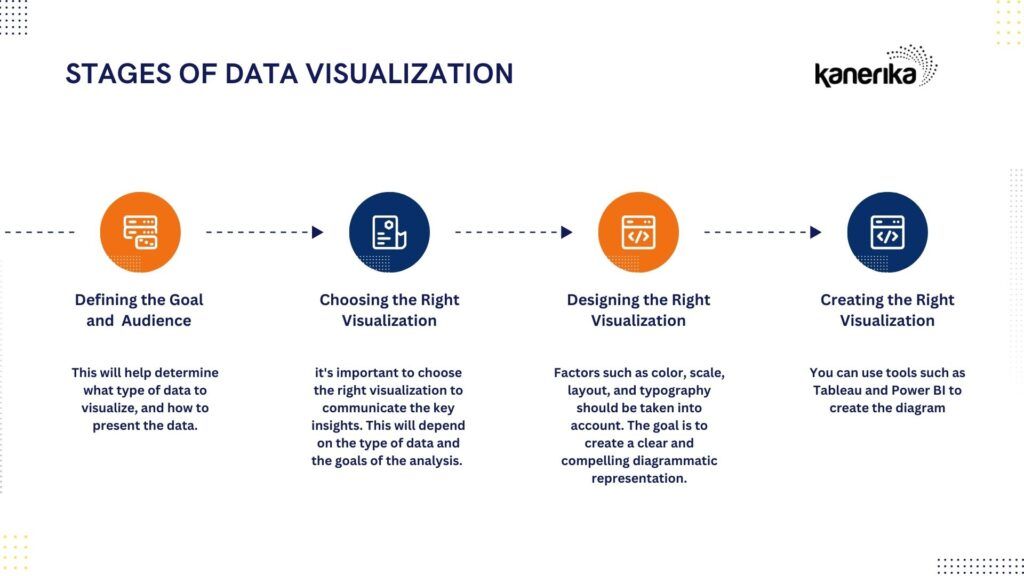
Steps of Data Visualization
The process of data visualization involves careful planning, design, and implementation. Effective visualization also requires careful attention to color, scale, and layout.
Define the goal and audience
The first step is to define the goal of the visualization and the intended audience. This will help determine what type of data to visualize, and how to present the data.
Choose the right visualization
Once the data is ready, it’s important to choose the right visualization to communicate the key insights. This will depend on the type of data and the goals of the analysis. For example, the revenue generation comparison between Company X and Y can be shown through line charts but the sources of revenue of Company X and Y can be better displayed through a pie chart.
Design the visualization
The next step is to design the visualization, taking into account factors such as color, scale, layout, and typography. The goal is to create a clear and compelling diagrammatic representation.
Create the visualization
The last step is to create the visualization using the chosen tools and software. You can use tools such as Tableau and Power BI to create the diagram.
Commonly Used Visualization Tools
Spreadsheets are of immense use for quickly creating diagrams. However, they are quite rudimentary. There are many tools for visualizing data, depending on your needs and preferences.
Some of the most popular and widely used tools are:
- Tableau: A powerful tool that can create interactive charts, dashboards, maps, and stories.
- Power BI: A business intelligence tool that can connect to hundreds of data sources and create reports and dashboards.
- Qlik Sense: A self-service analytics tool that can leverage artificial intelligence and natural language processing to generate insights.
- Zoho Analytics: A tool that offers features such as a drag-and-drop interface, pivot tables, widgets, and collaboration.
- Cluvio: A tool that can run SQL queries and R scripts on your data and create interactive dashboards and charts.
- Google Data Studio: A free tool that can connect to Google products and other data sources and create reports and dashboards with customizable visualizations.
Optimize Your Data Processes with FLIP
We have told you what data visualization is. But how to have access to your data without waiting for your IT team to configure the software?
Do you wish there was a way to simplify your data integration and transformation process and improve your workflow efficiency?
Well, we have some good news for you! Our product, FLIP, streamlines data processes and helps you transform your data effectively before plugging it into a data visualization tool. Without standardized data formats and effective transformation, visualization tools have a hard time
With features like data lineage tracking, error handling, and collaboration, FLIP makes managing your data pipelines a breeze. It can create custom data visualization and integrate it with other tools and platforms, making it a cross-platform solution that fits in perfectly with your existing data pipeline.
Sign up now for a 30-day free account!
FAQ
[faq-schema id=”16203″]
Thank you for reading our new series of posts on FLIP. If you want to know more about Kanerika and FLIP, please write to us at [email protected].
Follow us on LinkedIn and Twitter for insightful industry news, business updates and all the latest data trends online.